the story behind illatos
One of the questions I get most often is where the idea for illatos comes from.
My totally honest answer is that there was never a master plan for that. Most of it came together step by step, from random shower thoughts and the rest of course, was shaped by places, memories and small decisions that only started to make sense once I looked back.
The name was actually the easiest part.
Illatos is a Hungarian word, a nice compliment. You could translate it as fragrant or scented, but neither really captures what it means. It's not a word we use for perfume. It's something you might say to a friend after a hug, or when you walk into a home that smells comforting. Keeping the Hungarian name felt like an authentic and honest choice. It reminds me where I come from, even though illatos itself is being built somewhere else.
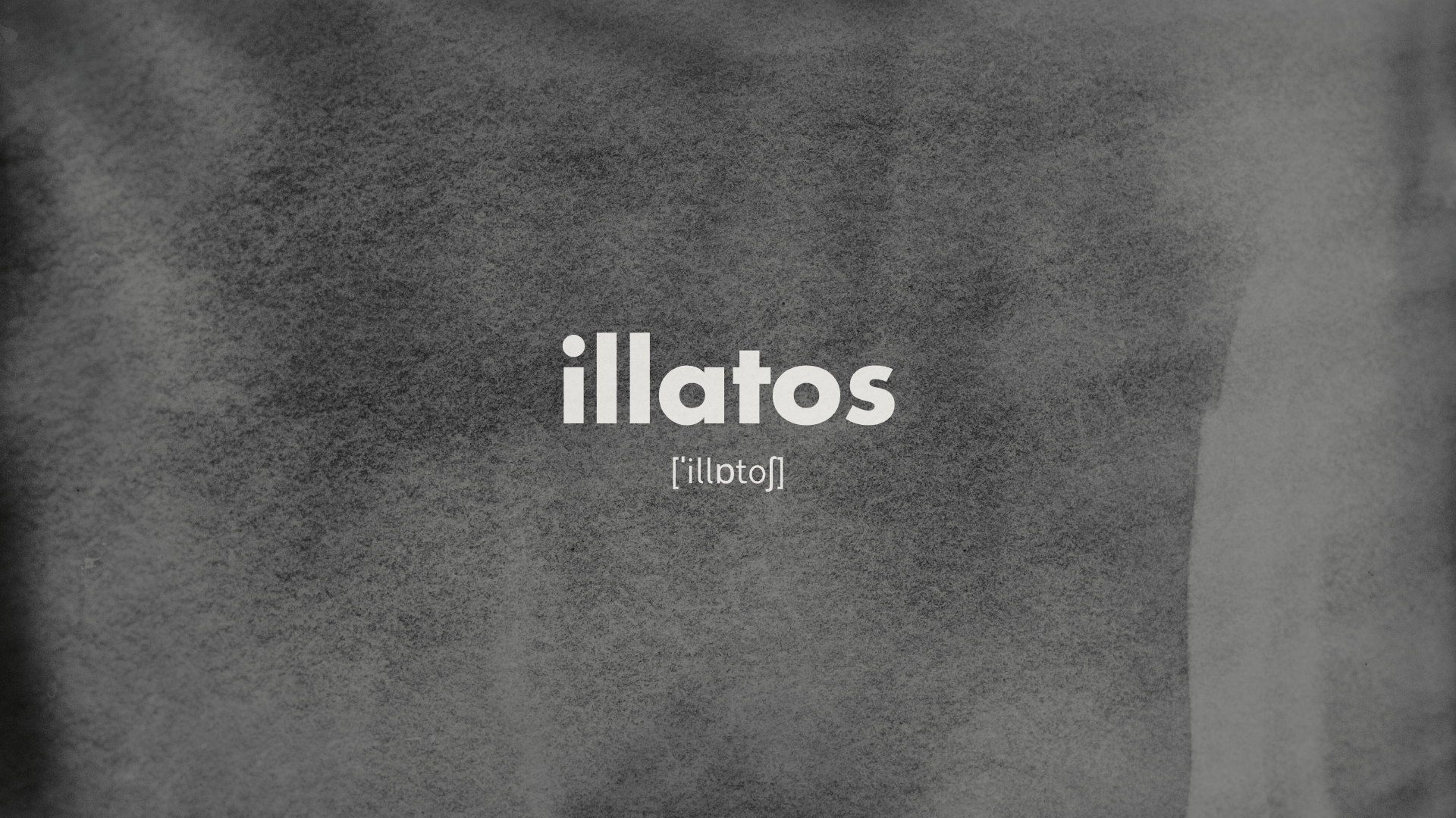
That also explains the pronunciation underneath the logo. Most people outside Hungary instinctively read it as "illetos" and I completely get that. Hungarian isn't the easiest language. Adding the phonetic spelling felt like something out of a dictionary: a bit nerdy, a bit playful and a small way of keeping my heritage visible.
The logo started in Italy, although not in the way I would have expected. It was inspired by the Italian railways.
Last summer, after a difficult year, I travelled through Italy. As I mentioned in a previous Instagram post, that trip was when I finally stopped waiting and decided to give illatos a real chance.
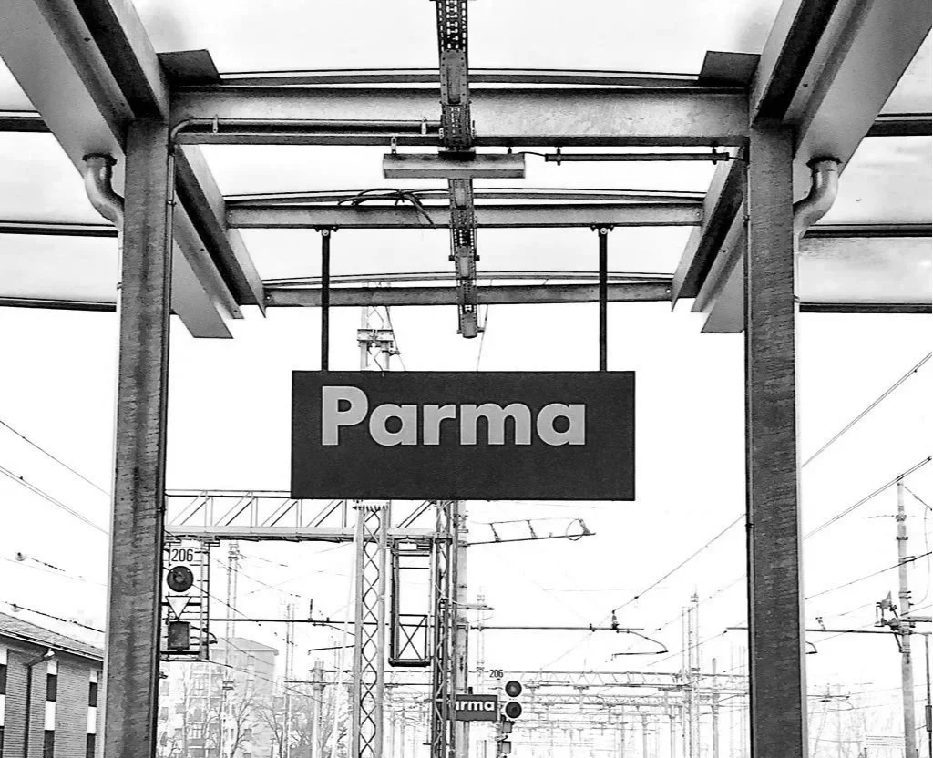
On the train to Rome (I couldn't tell you the station name today) but something clicked in me. It was clear, unshakeable. You know that gut feeling that this is it. I found myself staring at one of the Italian railway signs for far too long. Dark navy background. White Futura Extra Bold lettering showing the destination. Clear, geometric and confident.
Photo source: x.com - Prof. Erik Spierkermann @espiekermann
The logo still carries a small piece of that journey, because it's the moment illatos stopped being an idea I kept postponing.
Futura became the main typeface. Apertura, the secondary one, came to soften Futura's strength. Together they do what luxury fragrance branding usually doesn't: no gold, no glossy finish. Instead, I chose off-white, charcoal and muted grey. Colours that remind me of old photographs, notebook pages, poems and train tickets tucked inside books. No bottles, no flowers, no drops in the logo. Even the lowercase name was a conscious choice: I simply liked how it looked.
None of it was really about design. It was about being elegant without being exclusive, calm without being empty, nostalgic without getting stuck in the past. I'd rather it sparked a little curiosity and let the stories do the rest.
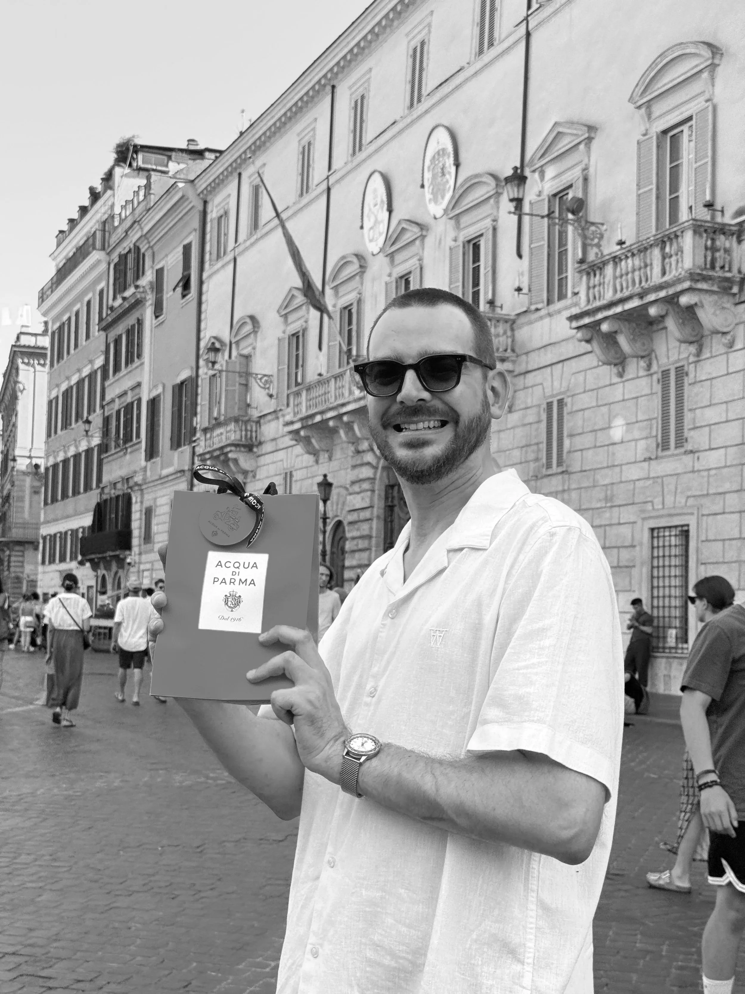
A year after that trip, I went back to Italy. Before leaving the previous summer, I'd promised myself that if everything worked out, I'd return and buy the bottle of Acqua di Parma I'd left on the shelf in the store next to the Spanish Steps. Of course I could have ordered it online, or bought it in Oslo months earlier, but that would have missed the point. Going back wasn't about the perfume. It was about keeping a promise I'd made to myself when illatos existed only in a notebook.
It's funny how brands are often expected to begin with a business plan or a strategy. Mine began with a Hungarian word, a railway sign, a difficult year, and a promise to come back.
